Studio C Pilates is a Pilates studio based in Asheboro, NC. Sarah Presnell is the proud owner of this studio and she contacted me with a couple of needs: a business card and a brochure. Her goals were to make networking easier, to grow her business, and to educate her clients with information about Pilates.
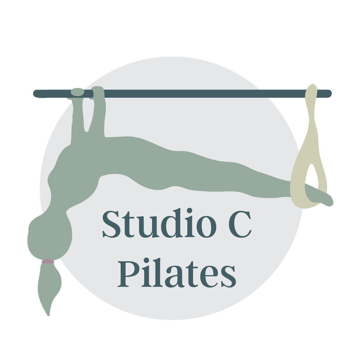
Problem 1: After discussing with Sarah and reviewing her goals, I started to work on her business cards. I ran into an issue: her previously designed logo files were low in resolution and she did not have the original files for me to produce better-resolution JPEGs. I also noticed that the believability/ realisticness of the woman in the logo could be improved. Her hands were misplaced on the bar and the corners of her body could be smoother. I also wanted to make the font somewhat larger to fix the white space and adjust colors for more readability.
With all of this in mind, I spoke with Sarah to address this issue. I wanted to produce the best business cards and brochures for her business, and I wanted her logo to stand out and look as professional as possible. Sarah agreed to allow me to redesign her logo; not to change too much, but to improve the resolution and adjust the fonts/ colors. Therefore, I moved her files into Illustrator and got to work!
Studio C Pilates original logo, not my own work.
Solution 1: I traced Sarah's logo in Illustrator with the pen and pencil tool as well as using the eyedropper tool to pull some of her original colors. The pictures below were the work-in-progress mockups. I sent these to Sarah to allow her to choose from different colors and fonts.
Changes made:
1. Changed the background color to allow certain elements to stand out better.
2. Fixed the woman's hand position and hand texture to look more realistic. I also smoothed the corners of her figure by using the smooth and pen tool.
3. Changed the font to match her style and allowed it to fit more appropriately within the circle.

Font option 1

Font option 2
Color option 2
Solution 1: Created Sarah's new logo with much higher resolution, believability, readability, and overall, matching her style more effectively. I created two final variations (below) for her to use depending on the colors and size needed.
Final Logo (variation 1)
Final Logo (variation 2)
Problem 2: Sarah needed business cards to help her advertise and network her services. I came up with a few mockups below for her to choose from. (Colors are different from the original file due to file conversion).
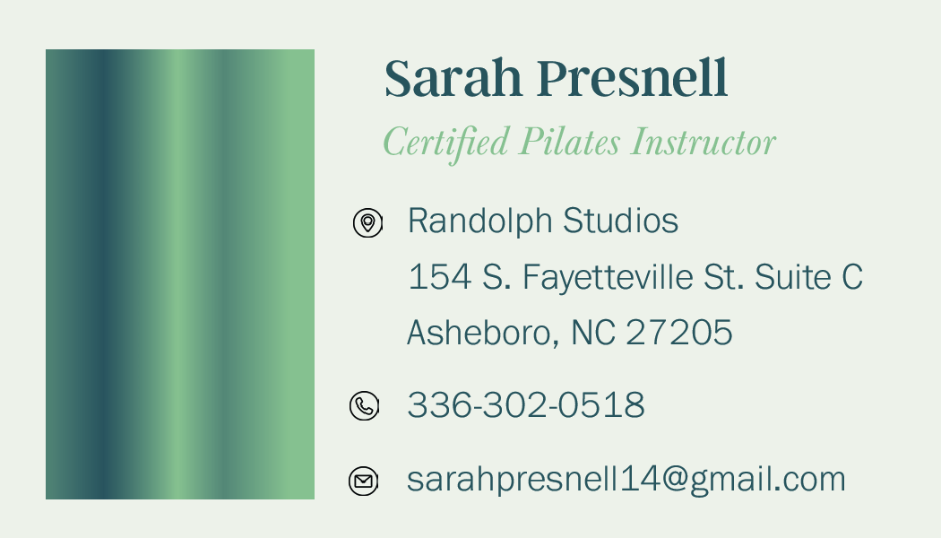
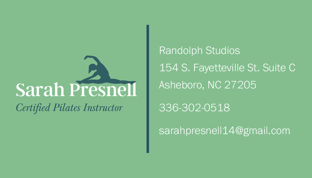
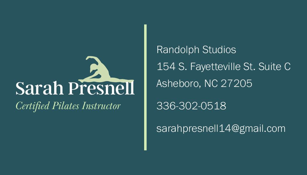
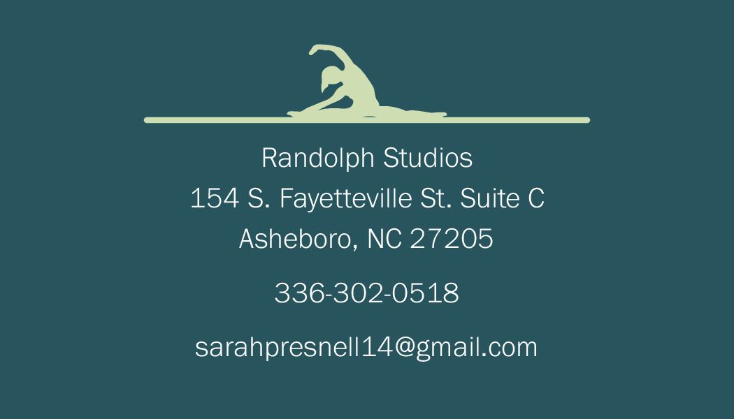
Solution 2: After discussing with Sarah, she decided she wanted a simpler look and her name not to appear on both the front and back. She loved the idea of a pose on the back of the card, but she preferred me to trace and image of her. Therefore, I created the final design below. This provided her with a new way to network and spread the word about her new business.
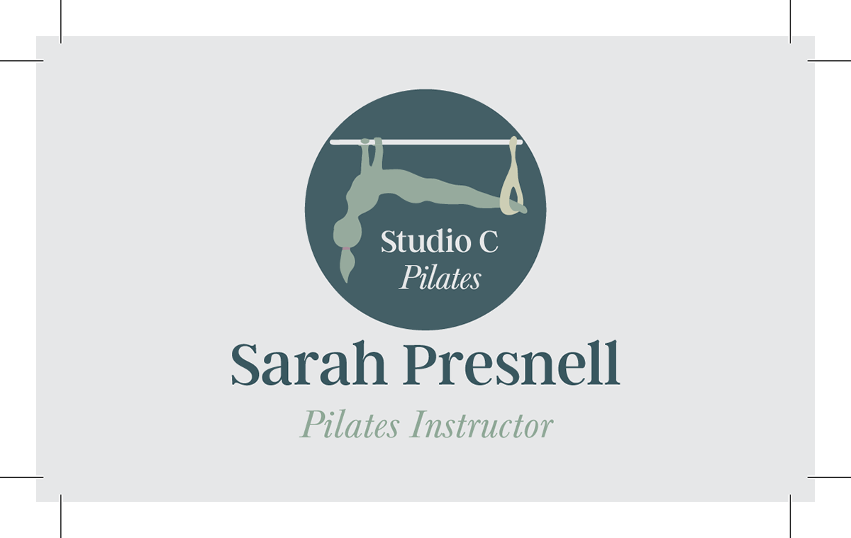
Front
Back
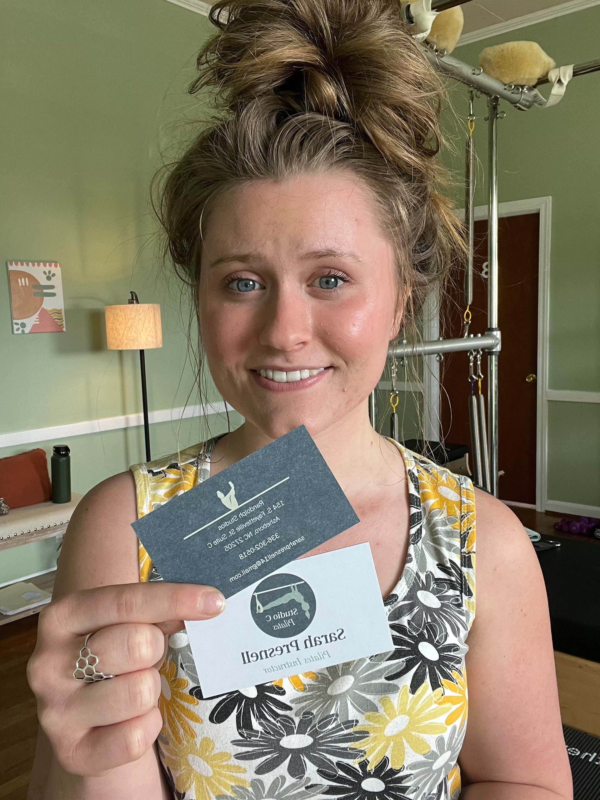
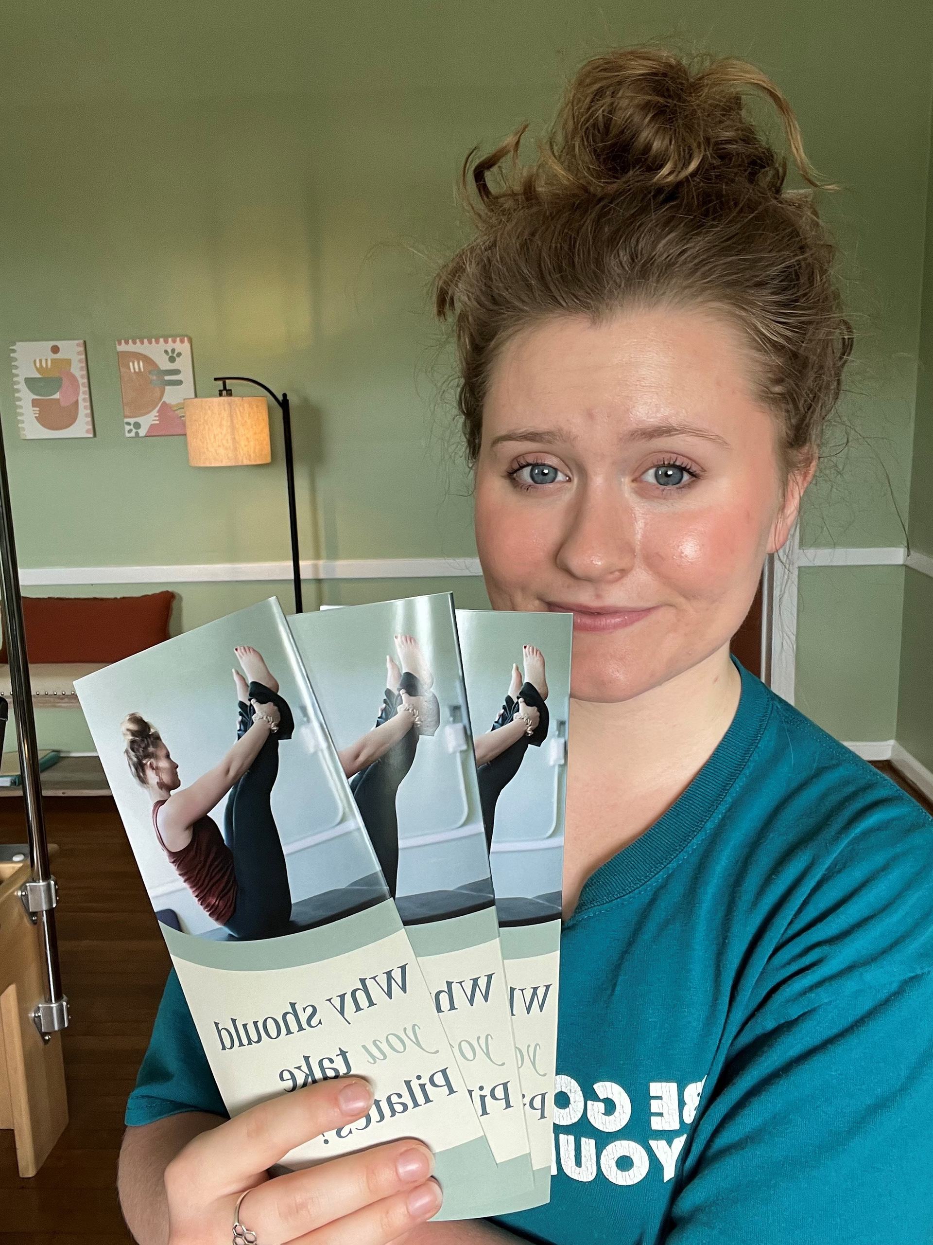
Sarah with cards
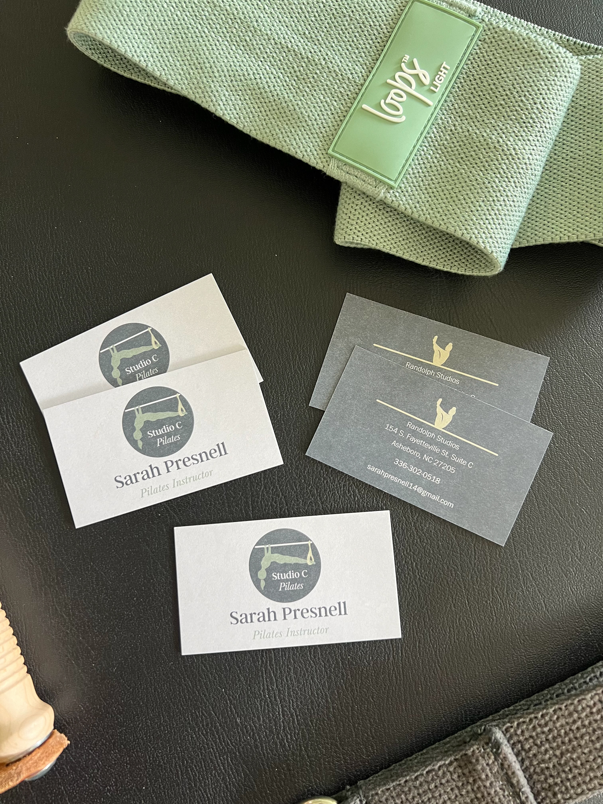
Display
Client Testimonial:
Problem 3: Sarah needed a way to inform the public as well as her clients of her services and history of pilates. She wanted a pass-out brochure that displayed her services, contact information, and pilates information/benefits. I started with the mockup below.
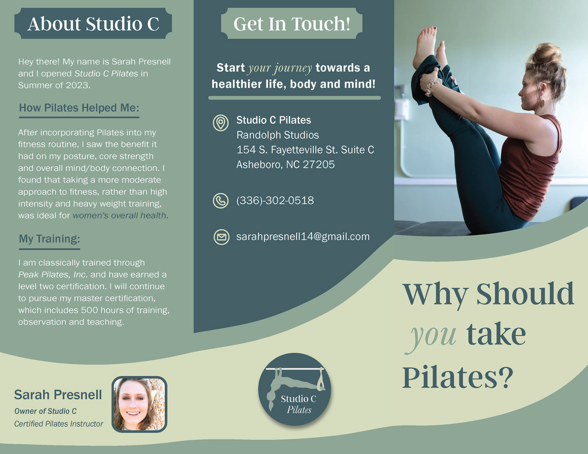
WIP 1
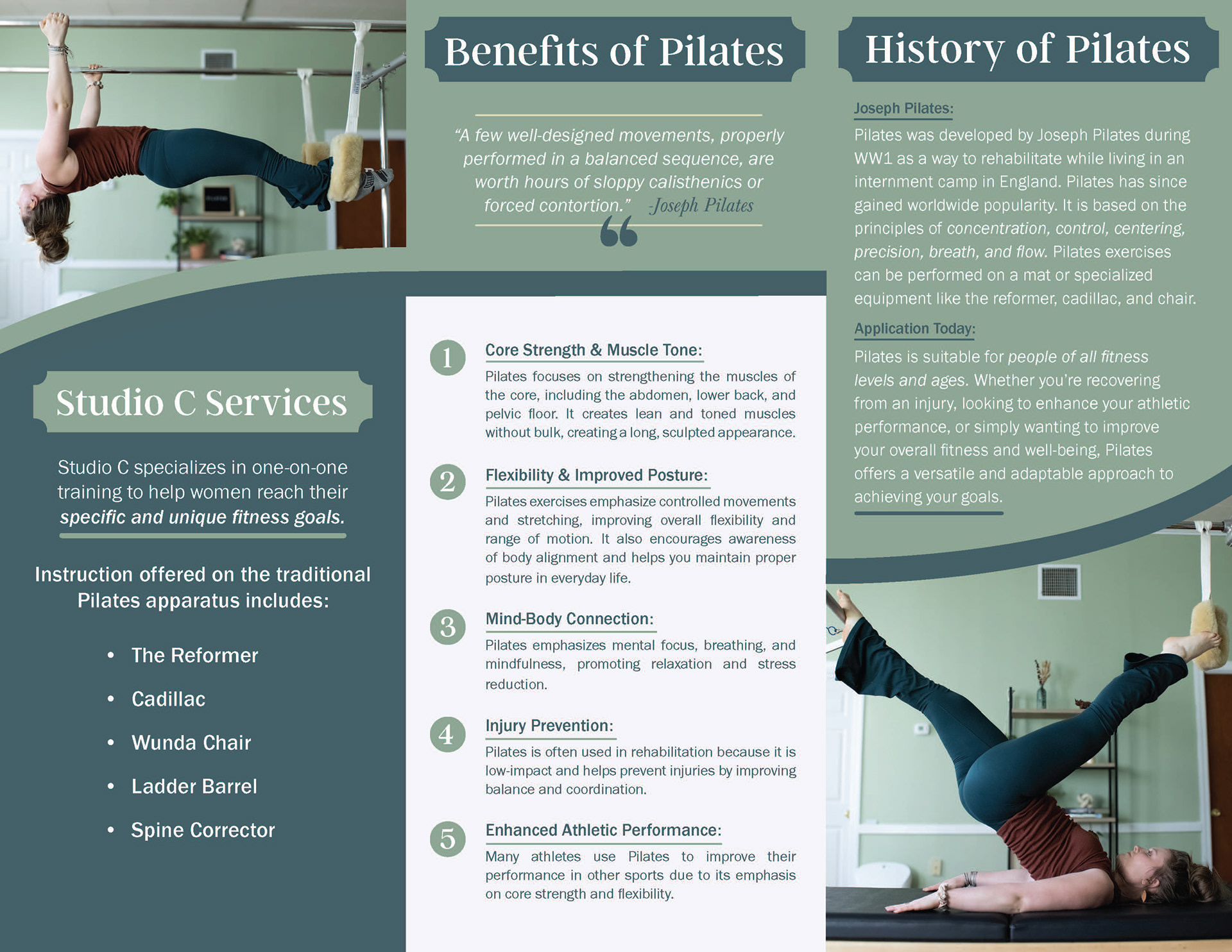
WIP 2
Solution 3: After some grammar changes, alignment changes, image touch-ups in Photoshop, and color touch-ups, we finalized the design below. This brochure will allow her to inform her clients and create a meaningful experience when networking. I ensured that each page worked together for viewers who opened this brochure. For example, the "about" page and the "services" page will be side by side when folded. This ensures that a viewer can understand the business and how to be a part of it in a quick manner.

Outside Cover
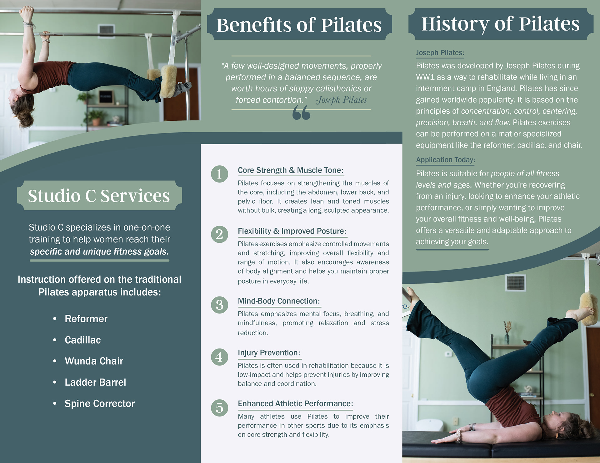
Inside Cover
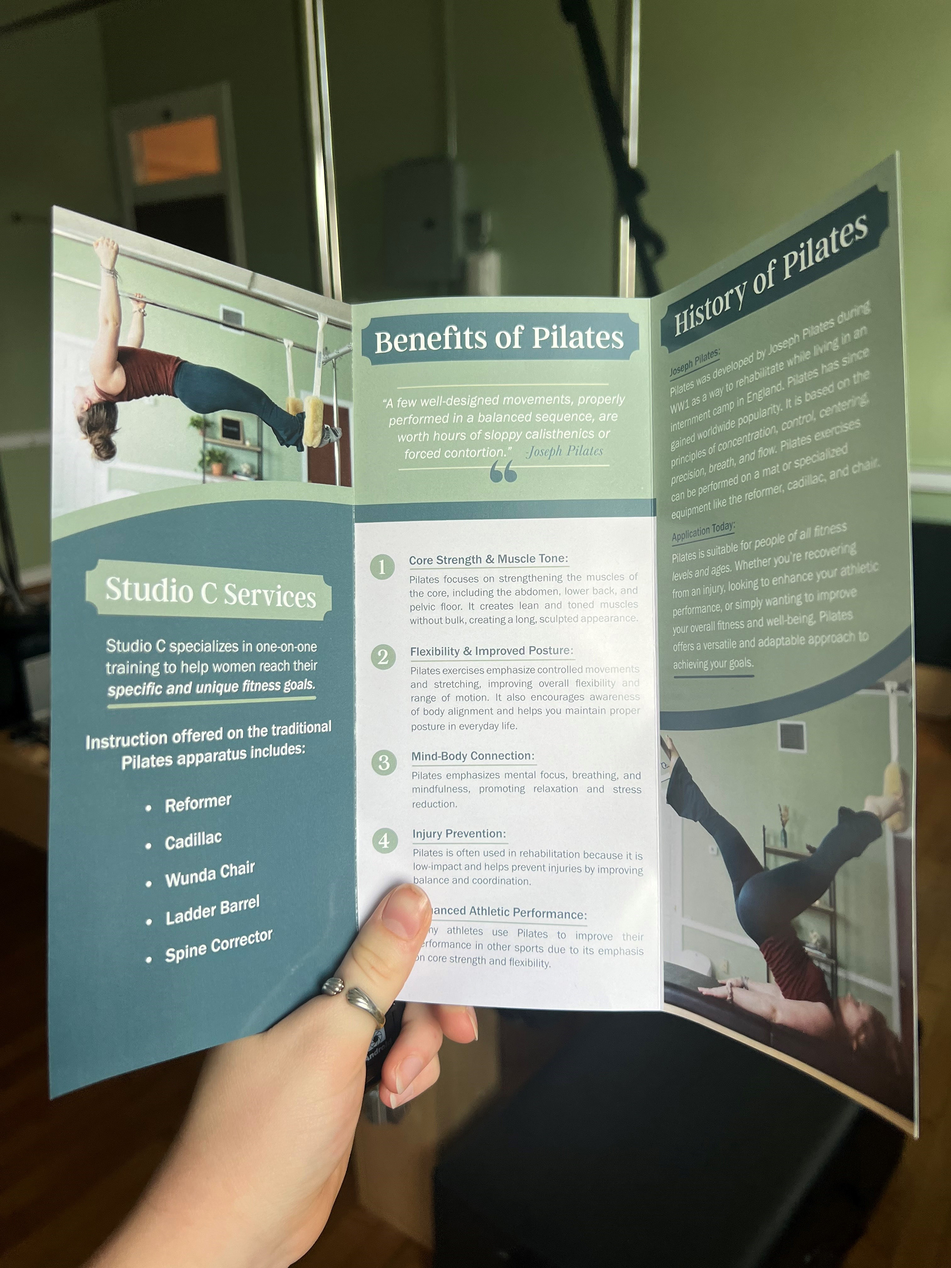
Display 1
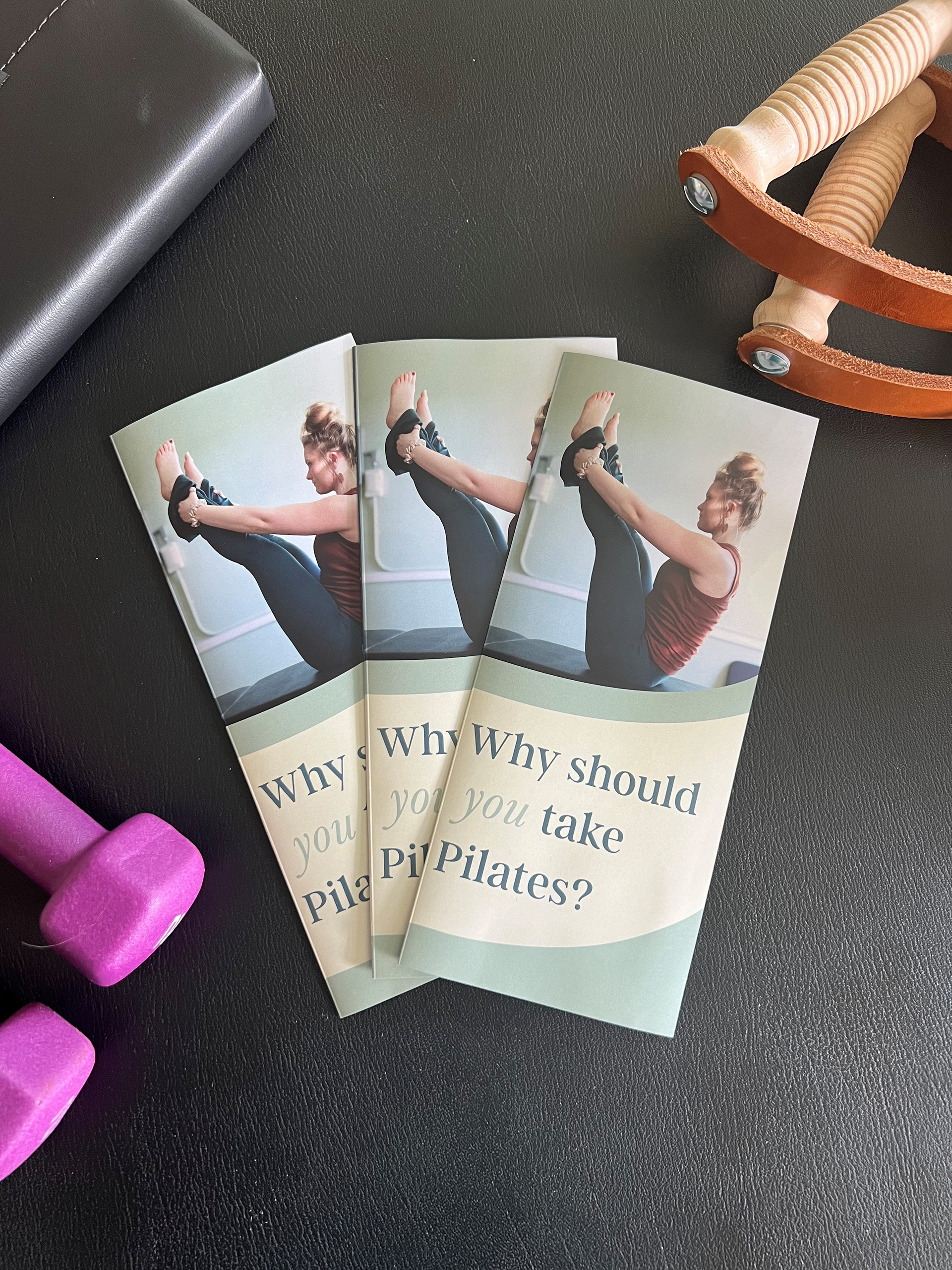
Display 2
