I myself, worked as the team leader with a group of designers to create 6 deliverables for our client, Thriving Twentysomethings . We created the following: Business & personal logos,
merchandise (pens and notebooks), website edits (Wix), a business card, Instagram templates, and a unique brand color scheme. I will display deliverables I personally developed or assisted in creating.
merchandise (pens and notebooks), website edits (Wix), a business card, Instagram templates, and a unique brand color scheme. I will display deliverables I personally developed or assisted in creating.
Business Logo
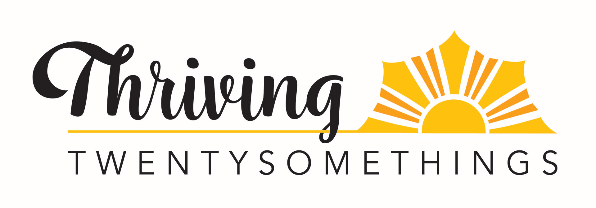
As a team, we all worked together to create the central focus of the brand: the logo. Nadine (our client) wanted to represent her personality, heritage, and her target audience through her logo. We made it bright and bold, just like Nadine; pulled the yellow from the Philippine flag to represent her heritage; and we made the sun the focal point to represent her target audience: thriving Asian American healthcare workers in their twentysomethings, shining like the sun.
Colored Logo
Black variation
Personal Logo
Nadine also wanted a logo for her personal speeches, presentation slides, and social media. I solely worked on this deliverable using Illustrator to make a logo that was cohesive with her business logo but solely focused on her skills and personality. My solution was to select a flowy and bold font, used her brand color scheme, and added her initials and her personal skills.

Client Review
Website Edits
I myself and Atalya Sigler, worked together to update our client's website to look more professional, cohesive with her brand, and more accessible. We fixed widows in paragraphs, margin issues, adjusted fonts, and fixed image resolution. We then updated her website colors to match her new color scheme and better represent her brand as a whole. We added her new logo and adjusted colors to make sure the website was more accessible. For example, there was white text on yellow backgrounds which we then changed to black on yellow to create more contrast and allow more readability.
Before
After
Instagram Templates
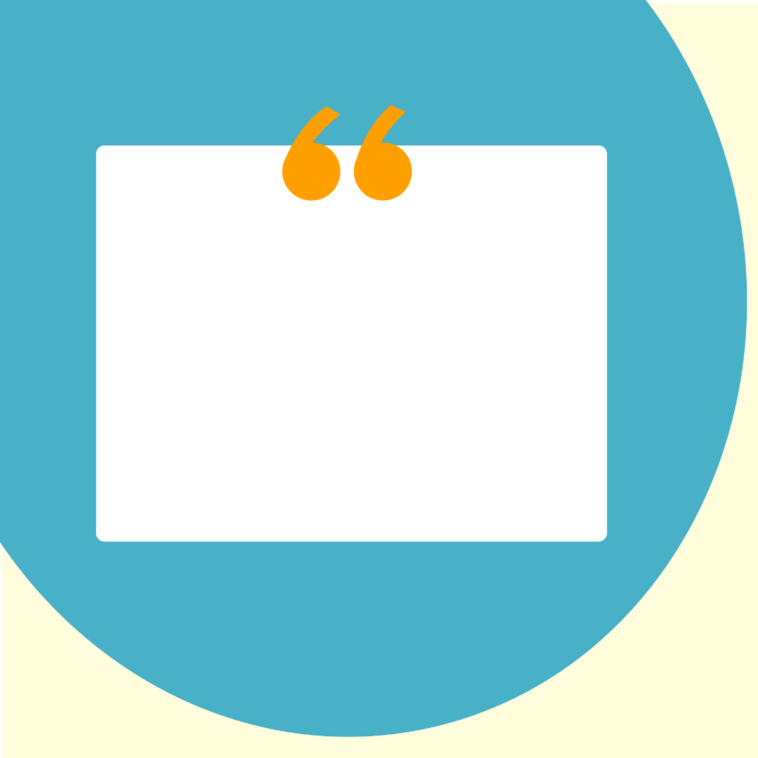
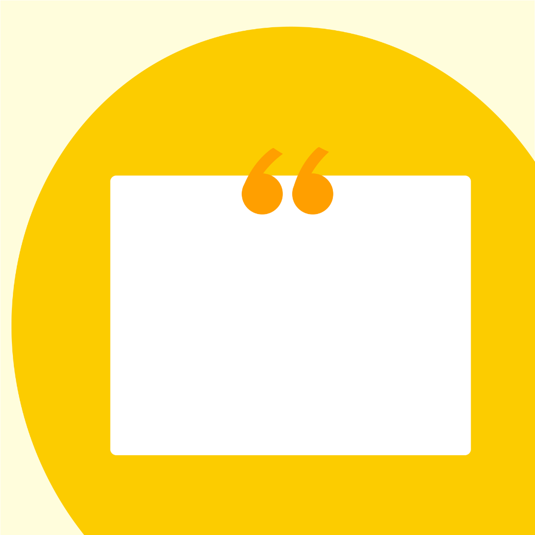
Our client wanted Instagram templates to create more consistency across her page and cohesiveness with her brand theme and website. I performed research on what life coaches post frequently on Instagram so that I could create the best and most useful templates for her to use. I found that quotes were a must, so I created multiple variations of quote templates to create consistency across her page and used a trendy style to catch her follower's eyes.





Merchandise
I worked with my group to find the best quality notebooks and pens for our client. We discussed her budget on this deliverable and did some research from there. We used Vistaprint and Pens.com to create the best merch for our client.
Color Scheme
Lastly, I worked alongside my teammates to create a palette that represented the client's brand and personality. We used Adobe Color to create bright colors that portray freedom, empowerment, and positivity. In addition to this, the yellow was pulled from the Philippine flag to represent our client's heritage and target audience.
